Home
About
Recipe Index
All Recipes
Mains
Sides
Breads
Sweets
Snacks
Scratch Kitchen
Recipe Box
Contact
CITR Classic
☰
Search for:
Latest Recipes
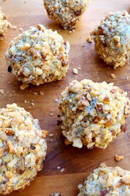
Herb & Onion Cheeseball Bites
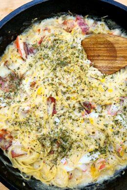
Crab, Corn, Bacon Pasta Bake
Pumpkin Spice Crunch Cake
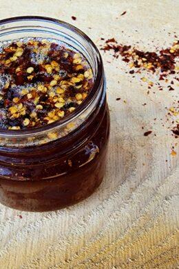
How to Make Hot Honey
Cranberry Orange Braid
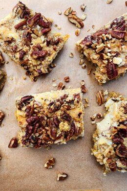
Pecan Pie Loaf Cake
Breads
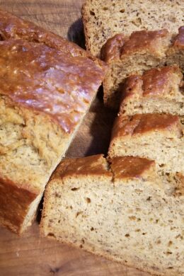
Cranberry Orange Braid
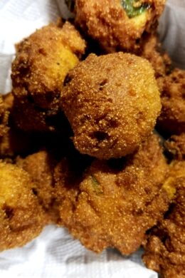
Quick Easy Hush Puppies
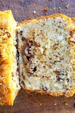
Best Ever Banana Bread
View More in Breads
Mains
Crab, Corn, Bacon Pasta Bake
Cowboy Casserole
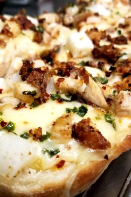
Leftover Fried Chicken Pizza
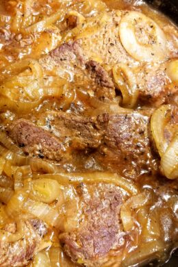
Salisbury Steak
View More in Mains
Scratch Kitchen
How to Make Hot Honey
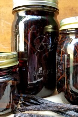
Vanilla Extract Everything
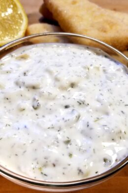
Homemade Tartar Sauce
View More in Scratch Kitchen
Sides
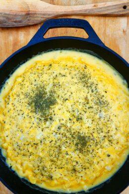
Baked Skillet Mac n Cheese
Homemade Onion Rings
View More in Sides
Snacks
Herb & Onion Cheeseball Bites
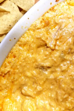
Slow Cooker Buffalo Chicken Dip
Jalapeno Poppers
View More in Snacks
Sweets
Pumpkin Spice Crunch Cake
Pecan Pie Loaf Cake
Dark & Chewy Brownies
Brown Sugar Bacon Doughnuts
View More in Sweets